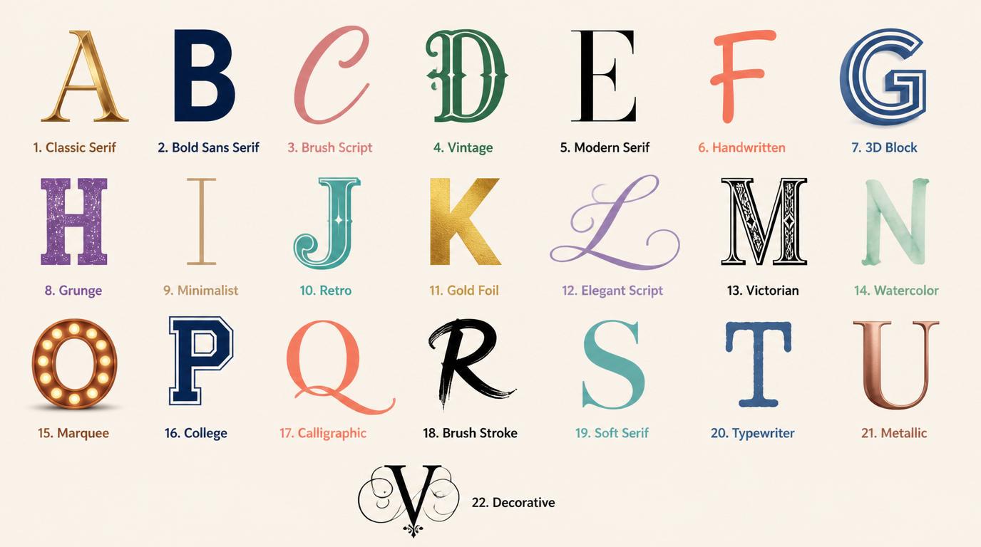
The Impact of UI/UX Fonts on Digital Interfaces
UI and UX fonts play a pivotal role in shaping how users engage with digital platforms. The right typeface can enhance legibility, create visual hierarchy, and ensure consistency across various devices. This guide explores 25 selected typefaces, covering font families, webfonts, and variable fonts. You’ll find insights into x-height, weight range, and hinting, allowing you to gauge each font’s performance on mobile devices, tablets, and desktops. Additionally, expect practical pairing suggestions, accessibility tips for contrast and sizing, and advice on testing typography within actual UI flow.
1. Balimo Font
Balimo combines a geometric structure with softened terminals, resulting in readable letterforms fit for various contexts. Its careful letterspacing and consistent x-height ensure clarity in both headlines and compact labels. The family scales predictably, maintaining distinct weights without disruptive shifts in color, while italics add a subtle emphasis. With its multilingual support and balanced personality, Balimo is ideal for dashboards, marketing sites, and editorial layouts.
“I find Balimo perfect when a project demands a simple, character-rich sans that excels across devices. Its effective spacing and hinting save time in micro-adjusting text during prototyping.”
[Download Balimo Font]
2. Gradvis Font
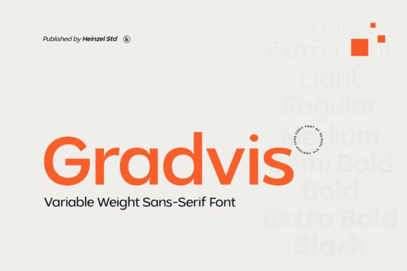
Gradvis features a precise geometric framework softened by subtle terminals, delivering a calm neutrality suitable for both print and web. With a predictable stroke contrast and approachable x-height, the font ensures readability for longer texts and impressive presence for larger displays. Its efficient file weight and hinting enhance rendering on low-resolution displays. Gradvis pairs seamlessly with humanist serifs or condensed grotesques, making it ideal for editorial projects, packaging, and interface typography.
“When a project seeks a clean and straightforward sans with a hint of character, I choose Gradvis. Its responsive approach simplifies the design process.”
[Download Gradvis Font]
3. Perfect Corporate
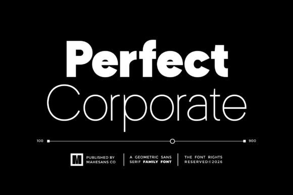
Perfect Corporate encompasses a broad geometric family, offering nine distinct weights designed for precise typographic control. This versatility allows for effective hierarchy management, ensuring that thin captions contrast beautifully with bold headlines. The font’s consistent proportions keep long documents comfortable to read. PUA-encoded glyphs further enhance accessibility for international branding needs, making it suitable for both marketing and documentation.
“For companies requiring a cohesive type family across materials, I often recommend Perfect Corporate. Its variety curbs the urge to mix fonts, promoting visual consistency.”
[Download Perfect Corporate]
4. Gloomy Arcade
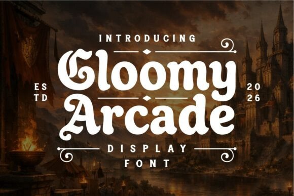
Gloomy Arcade melds retro arcade aesthetics with a medieval influence, giving headlines and logos a striking presence. Its dramatic glyphs combine heavy silhouettes with slightly irregular terminals, making each character stand out as a miniature emblem. Suitable for UI/UX applications, Gloomy Arcade offers a unique display option that maintains clarity at larger sizes. Use textured color schemes to enhance the theme while pairing with a neutral sans for the supporting copy.
“Gloomy Arcade is my go-to when a project needs a touch of theatrical flair without compromising readability. It’s perfect for game menus and brand logos that require character.”
[Download Gloomy Arcade]
5. Cenzo Font
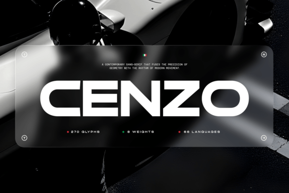
Cenzo exemplifies geometric restraint with crisp terminals and a steady x-height. This careful design translates well to both small interface sizes and larger headlines. Its balanced proportions bring a contemporary feel while allowing for multiple weights and character alternates, making it an excellent choice for identity work and UI designs.
“Cenzo is ideal when a project demands a polished, refined voice that supports content without overshadowing it. It’s fantastic for corporate identities and editorial layouts.”
[Download Cenzo Font]
6. Fagor Font
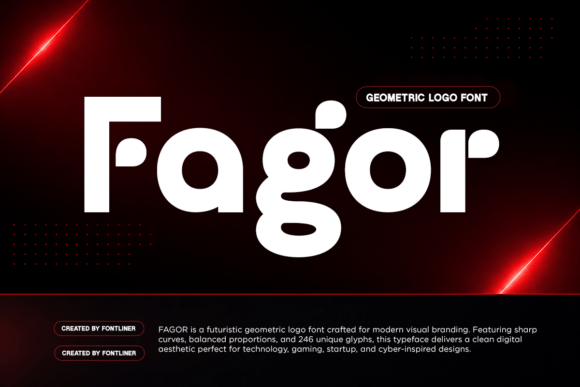
Fagor leverages geometric forms and smooth curves to create a bold, futuristic appearance that excels at display sizes. This font features monoline strokes that ensure clear legibility, ideal for logos and tech branding. Alternate glyphs allow you to shift between mechanical and humanistic vibes, enabling you to fine-tune identity aspects effortlessly.
“I recommend Fagor for brands wanting a forward-looking aesthetic that’s strong yet uncomplicated. It’s especially suitable for tech startups and gaming brands.”
[Download Fagor Font]
7. Gc Epicpro
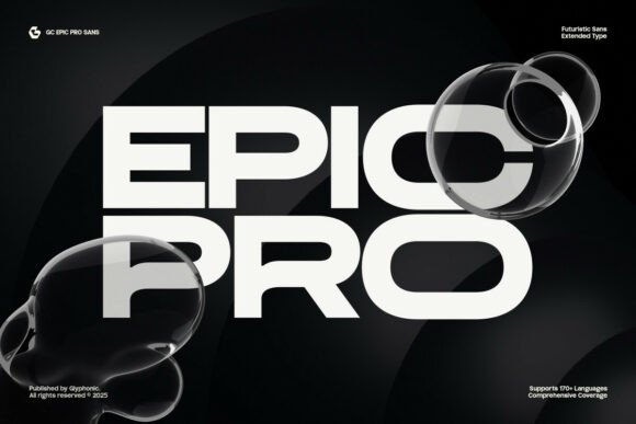
Gc Epicpro, an extended sans-serif display font, merges futuristic elements with wide proportions and crisp geometry. The design strikes a balance between presence and legibility, making it an excellent choice for interfaces and banners. The font’s inclusive character set, along with its language support, makes it versatile for tech branding and esports applications.
“Whenever a project requires a clean, forward-thinking headline, I turn to Gc Epicpro. Its robust alternate set facilitates quick custom wordmarks.”
[Download Gc Epicpro]
8. Barion Font
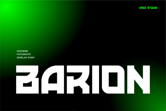
Barion portrays a bold, futuristic essence, perfect for attention-grabbing applications like posters and motion graphics. Its assertive letterforms maintain clarity for large typesetting, making it suitable for hero headers and brand identities. The design’s strong silhouettes work well in high-energy promotional materials.
“Barion is my choice for projects needing a headline that showcases modern industrial design. It’s ideal for tech campaigns and film titles.”
[Download Barion Font]
9. Gatecode Font
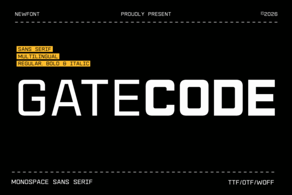
Gatecode is a contemporary monospace sans serif inspired by coding aesthetics. With even character widths and a neutral tone, it’s perfect for coding applications, terminal UIs, and product screens. Its legibility and balanced spacing make it ideal for dense editorial content, developer tools, and dashboard tables.
“When clarity and technical precision are required, I reach for Gatecode. It’s a reliable choice for developer-focused projects and interfaces.”
[Download Gatecode]
10. Reang Lanira
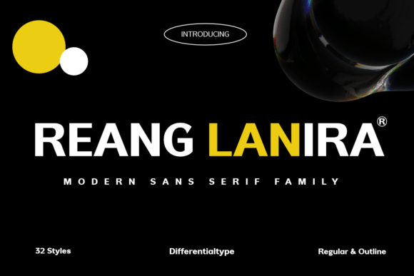
Reang Lanira balances geometric precision with an industrial character, delivering a modern sans serif that reads well on small screens and large formats alike. The family boasts 32 styles, providing ample choices for typographic hierarchy. Its letterforms ensure clarity in navigation bars, headlines, and wayfinding systems.
“Reang Lanira is perfect when you need a disciplined, assertive typographic voice for enterprise dashboards. The extensive style range offers flexibility for any design need.”
[Download Reang Lanira]
11. Saga Grotesk
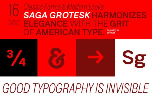
Saga Grotesk provides a clean blend of geometric restraint and elegant proportions, available in 16 well-spaced styles. Its classic ratios create a pleasant rhythm that works effortlessly for both extended body text and concise headlines. The font excels in editorial work and branding where a poised yet neutral voice is required.
“When brands need to communicate restraint and clarity, I recommend Saga Grotesk. It easily accommodates varying widths while maintaining visual appeal.”
[Download Saga Grotesk]
12. Methane
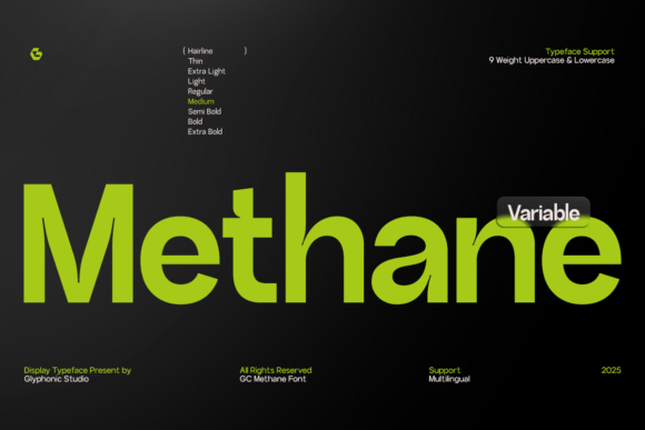
Methane is a clear and purposeful sans that combines geometric foundations with carefully measured proportions. This type system is versatile, providing a weight palette that supports both hierarchies and emphatic headlines. Its open counters and stable terminals make it an excellent choice for complex interface elements.
“I choose Methane for projects that demand tight typographic control and modern legibility. Its predictability and effectiveness make it ideal for dashboards and SaaS platforms.”
[Download Methane]
13. Backone Font
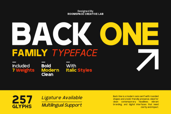
Backone presents a geometric sans that remains legible across high-density displays. Offering seven weights with true italics and PUA-encoded glyphs, this typeface stands out in UI environments. Its design helps establish a quick visual hierarchy, making it suitable for body text, headlines, and compact UI elements.
“Backone is my favorite for projects requiring precision on screens and print. Its excellent weight range allows for clear hierarchies without adding more typefaces.”
[Download Backone]
14. Exon Display Font
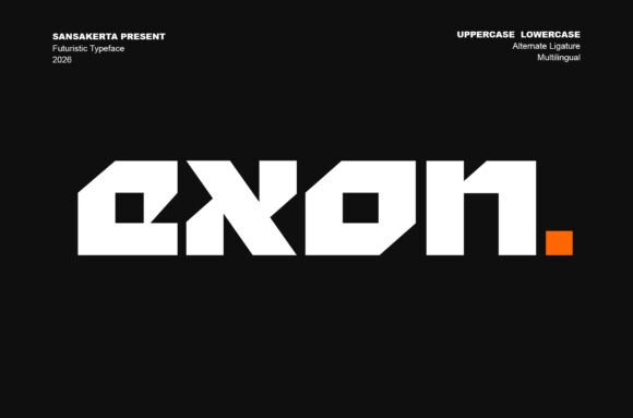
Exon channels a sci-fi aesthetic with sharp terminals and bold letterforms designed for impactful display use. Ideal for posters, logotypes, and headlines, its angular strokes offer a sense of movement and visual drama. Exon is best used as an accent font rather than body text, pairing effectively with neutral text families.
“Exon is perfect for brands that need a strong futuristic vibe without custom typography. It works well in gaming and tech-themed projects.”
[Download Exon Display]
15. Opinio Font
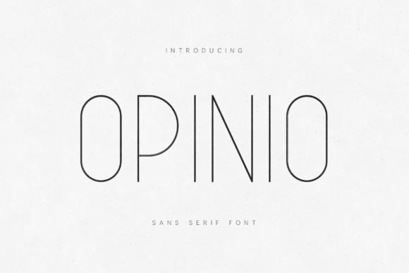
Opinio serves as a refined, slim geometric sans with airy letterforms and balanced proportions that convey elegance. Best suited for boutique packaging and upscale editorial layouts, this font provides consistent performance across print and digital. On interfaces, it shines in headings and generous layouts favoring negative space.
“I recommend Opinio for projects that require a sophisticated tone without sacrificing readability. Its fine strokes convey a polished, upscale feel.”
[Download Opinio]
16. Lotrance Font
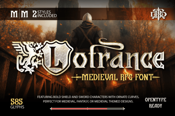
Lotrance channels medieval aesthetics with its shield-shaped counters and sweeping curves. As a display choice, it excels in headline contexts for game HUDs and splash screens, enhancing them with a ceremonial feel. Strong contrasts and careful kerning ensure legibility in demanding environments.
“Lotrance is my go-to for projects needing a touch of medieval flair without extensive illustration. Its themed glyphs add instant storytelling appeal.”
[Download Lotrance]
17. Digittal Font
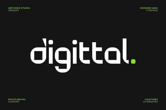
Digittal is a geometric sans designed for technical applications, featuring consistent geometry and open counters for clarity. Its compact forms and reduced visual noise lead to improve legibility, making it suitable for logging and UI interfaces. The well-structured spacing also aids in creating clean layouts.
“For technical identities, I often select Digittal. Its predictable performance ensures legibility across multiple formats.”
[Download Digittal]
18. Mega Binory Font
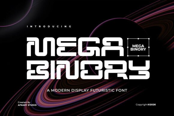
Mega Binory embraces a futuristic aesthetic with sharp corners and angled apertures, mimicking the look of circuitry. Its font family includes modular joins, offering versatility for strong tech branding, trailers, and promotional banners. This typeface stands out against high-contrast backgrounds and vibrant graphics.
“When a project requires an energetic sci-fi aesthetic, Mega Binory delivers. It’s perfect for gaming identities and visually striking designs.”
[Download Mega Binory]
19. Terra Naro
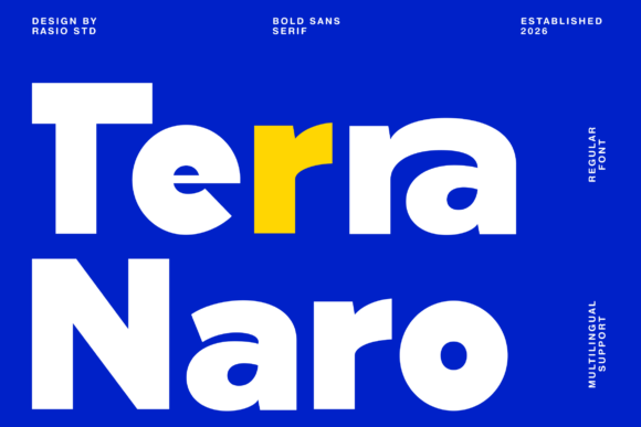
Terra Naro showcases a bold sans serif with compact geometry, ensuring a strong visual presence. This font excels at both display sizes and small screen readability, making it well-suited for headers, navigation, and UI elements. Its character shapes allow for tight tracking, reinforcing a modern feel.
“I pick Terra Naro when a standout headline is needed that remains readable on all device sizes. It serves beautifully in corporate and editorial contexts.”
[Download Terra Naro]
20. Bigoba Font
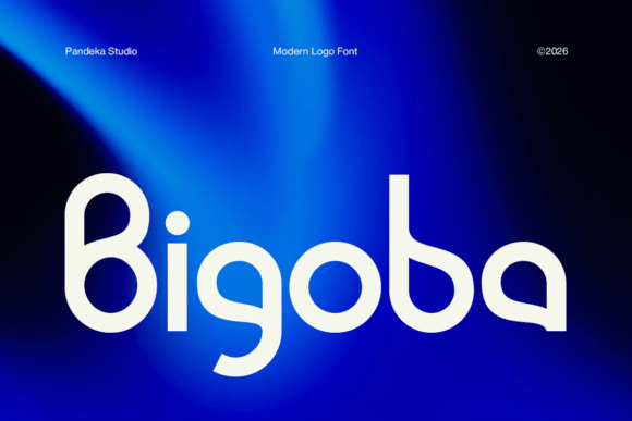
Bigoba is characterized by its geometric shapes and soft curves, creating a futuristic look for logos and wordmarks. With distinct terminals, this font maintains readability across various sizes, allowing it to be used for splash screens and prominent headlines.
“When creating a memorable logotype that is both unique and clear, I turn to Bigoba. It shines in modern applications where strong visual impact is essential.”
[Download Bigoba]
21. Averion Font
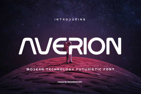
Averion conveys a space-age aesthetic through its modular strokes and open counters. This font captivates attention with short, high-impact copy and holds its ground in dynamic visuals like game interfaces and cinematic posters. Designed for display applications, it complements sleek, simple text families.
“Averion is my first choice for bold, modern branding that commands attention. It’s great for trailers and UI headers where every letter counts.”
[Download Averion]
22. Felbion Font
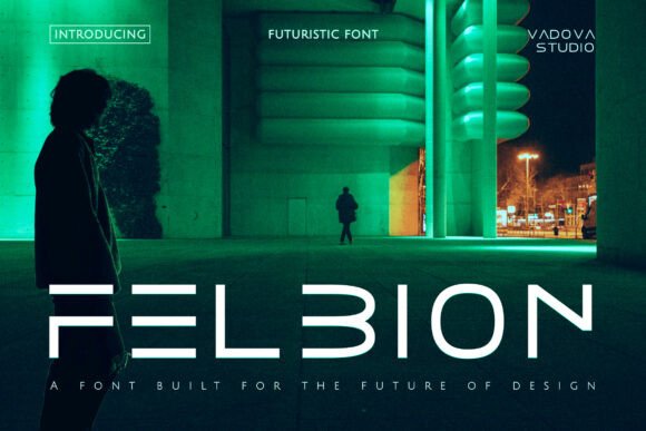
Felbion brings a robust, geometric look to tech-forward visuals. With angled terminals and compressed counters, this font remains captivating on screens and posters. Providing wide language support, Felbion excels in environments where impactful, cinematic headlines are crucial.
“For distinct sci-fi visuals, I often reach for Felbion. Its ability to maintain clarity and gravitas makes it perfect for immersive UI designs.”
[Download Felbion]
23. Anuaraga Fonts
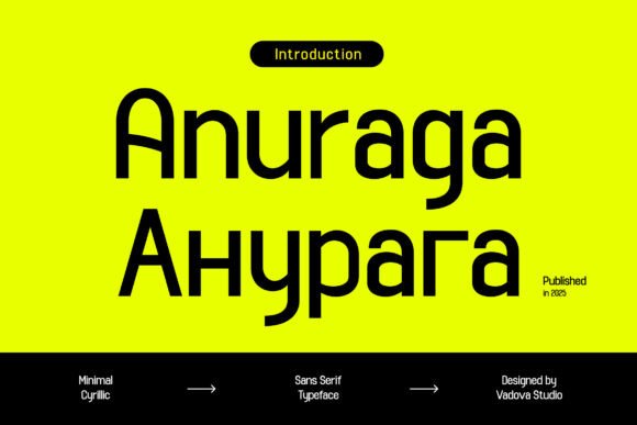
Anuaraga is an efficient Cyrillic sans font that enhances screen legibility. Its balanced weights and consistent rhythm make it ideal for UIs and editorial workflows. The font supports both Latin and Cyrillic, ensuring typography remains coherent across multilingual applications.
“I choose Anuaraga for projects needing clean Cyrillic support and dependable performance. It’s invaluable for editors and SaaS products.”
[Download Anuaraga]
24. Kelantis Font
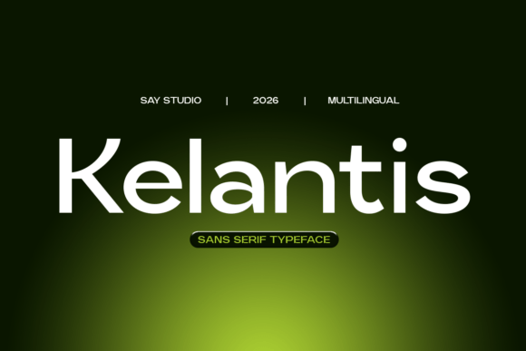
Kelantis is a modern sans typeface designed for clarity and versatility. Its neutral appearance works well in both UI labels and body text, maintaining an articulate typographic hierarchy. With solid performance across devices and print, it simplifies responsive typography.
“Kelantis is my go-to for polished typography that doesn’t draw attention away from content. It’s perfect for enterprise solutions and identity projects.”
[Download Kelantis]
25. Rimini Font
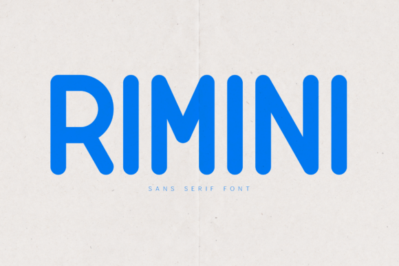
Rimini is a rounded sans-serif that balances clean geometry with soft terminals, creating an approachable, contemporary voice. Its open counters ensure legibility, making it suitable for various UI applications and packaging. The consistent letterforms enhance short labels while remaining readable in longer texts.
“I love Rimini when a friendly and modern tone is needed in a project. It enhances the user experience while maintaining clarity across interfaces.”
[Download Rimini]
These 25 typefaces provide designers with an excellent foundation for creating tech-focused and user-friendly interfaces. Each font comes with its unique advantages, enabling you to tailor your project’s typography to specific needs effortlessly. Experiment with these options in your prototypes, assessing their performance at various sizes and color contrasts, and prioritize families that offer variable axes or reliable hinting.